
CLIENT: Self-Directed project.
BRIEF: Develop the moving image based on typography.
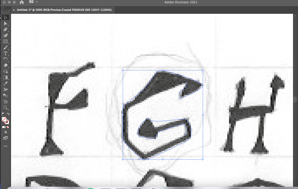
METHODOLOGY & KEY CONSIDERATIONS: I wanted to develop strange and weird typography by sketching on paper and then uploading it onto Adobe Illustrator to start vectorising the letterforms. Even those these letterforms don't appear like blackletter typefaces, my main priority is to learn how to develop letterforms that have decorative elements but essentially function as a digital font.
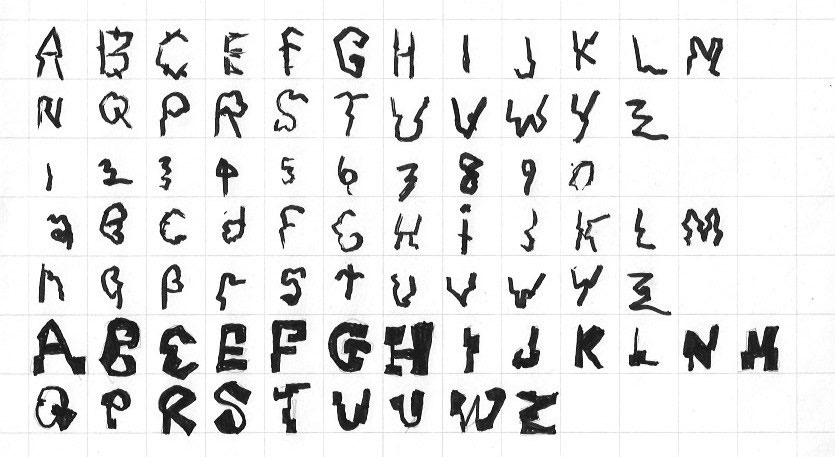
I was interested to get into developing my own typeface and I wanted to explore how to contemporise the gothic typeface in the modern setting. I am going to research, sketch type and then work on the anatomy of letterforms with Adobe Illustrator. As I am planning to develop a digital font family: I think I might take this further by presenting the type being used for the title sequence of the fictional TV/film by shooting my own footage.
I got inspired by the typography being used for Oneohtrix Point Never's Age of, album cover art and packaging as I loved how conventional serif typeface is traditional but remodified as something strange and new. I wanted to try and develop letterforms that have this disjoint style for its thin and thick strokes and I am trying to achieve this by presenting typography that helps to mythify subcultural folklore. I want to create a typeface that helps to introduce the story by imagining title sequences used for avant-garde shows or films. It would perhaps go for the vibe of Jim Henson's Labyrinth (1986) but, con temporised as a dark-out world experience like with listening to Oneohtrix Point Never music.
It was a very intriguing experience in using adobe illustrator to not just trace my sketches but reconstruct the letterforms as functioning serif typefaces. I would have to make sure that it would be readable and legible and so, I would keep testing.
By working on my letterforms, I started shooting video footage and using After Effects to help develop distorted videos. I wanted to try positioning customised weird letterforms onto manipulated video footage and, I have left some plain footage so that I can go back to plan A.
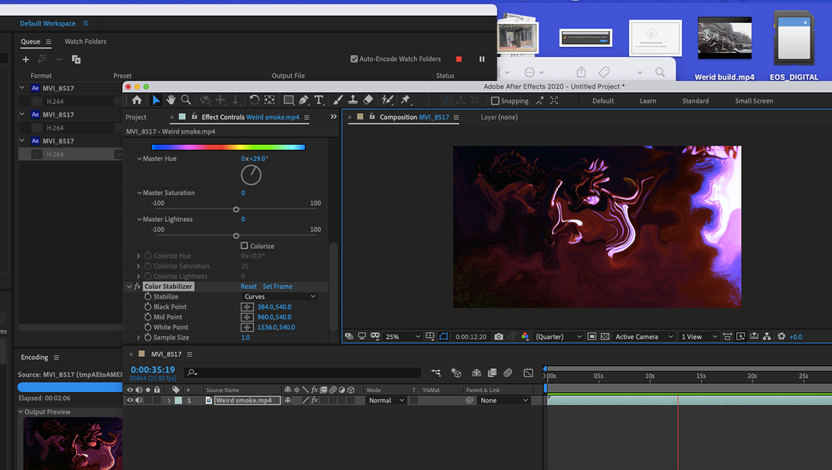
I didn't know what show to base the title sequence on. I thought about the idea of seven sins as it can be suitable for setting the gothic theme. I intend to place the titles as coloured texts onto the footage; I thought that I do better than that. I used the stencil effect tool to make the stencil out of the gothic typography by placing that footage onto the other one. You can probably tell by looking at these image examples. I make the change by just using non-distorted footage as they felt irrelevant.
Portfolio Rights: The Vendor shall retain the nonexclusive, perpetual, and worldwide right to showcase, reproduce, and distribute the designs within the Vendor's portfolio, website, third-party trade publications, awards, or exhibits. This usage is solely for the purpose of promoting and exemplifying the Vendor's work. Additionally, the Vendor shall have the right to be credited with copyright ownership and authorship of the designs in connection with such promotional use.